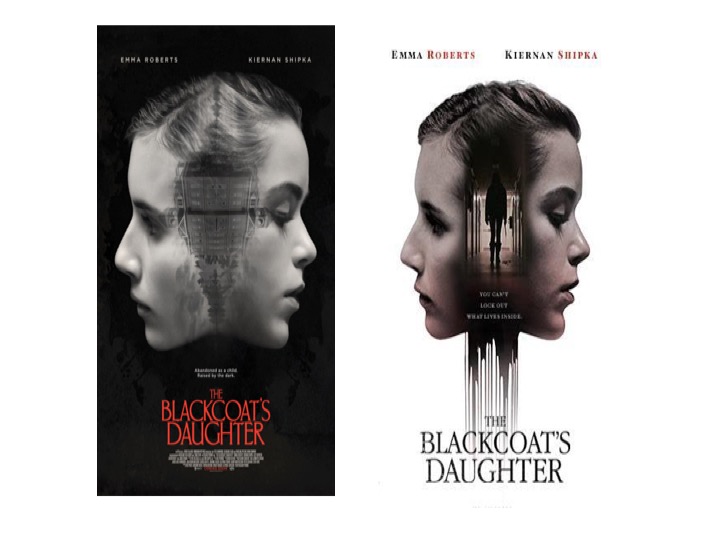
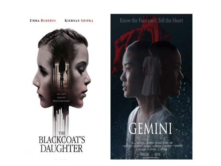
This is my chosen picture for the poster
Then I cut just her face and body and decided to flip the same picture in a horizontal way.
One increase the brightness of the picture to high contrast and the other with a very dark low lighting so it gives 2 personalities in one person.
Then I merged 2 pictures together into a Jpeg form in order to work easier.
FOR THE BACKGROUND
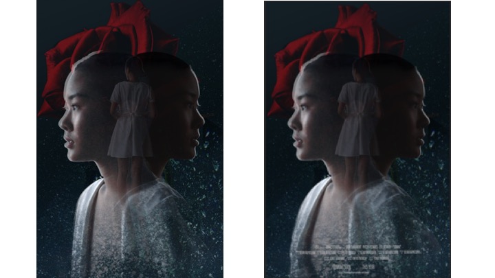
WITH & WITHOUT
Playing with the colour.
In here, I used Photoshop. Firstly, I distorted the picture, then faded the bottom of the picture with an easer tool.
I feel like making the bottom of her body fades would give a smoother effect and the outcome looked so much nicer, especially if with the Title
ADOBE ILLUSTRATOR
COMPOSITIONS AND COLOUR
Having the right size and composition can make a big difference to the poster.
FINAL OUTCOME
.
From my point of view, I feel like good poster can really make the difference and has an impact as it is the first thing that grabbed people's attention before they even go to watch a film.this is why I paid so much attention to it. It also defines the genre of the film and the target audience.